Dashboard Design · Analytics UX
Jan 10th – Mar 2nd
Dashboard Design · Analytics UX
Designed an audience analytics dashboard that transforms dense social media data into scannable, actionable insights for marketers.

The Problem
Marketers were drowning in raw numbers. Audience data lived across disconnected charts and exports: age demographics in one report, posting-time data in another, trending topics buried in a feed. Answering a simple question like 'who is my audience and when should I post?' required stitching together three tools and a spreadsheet.

The Solution
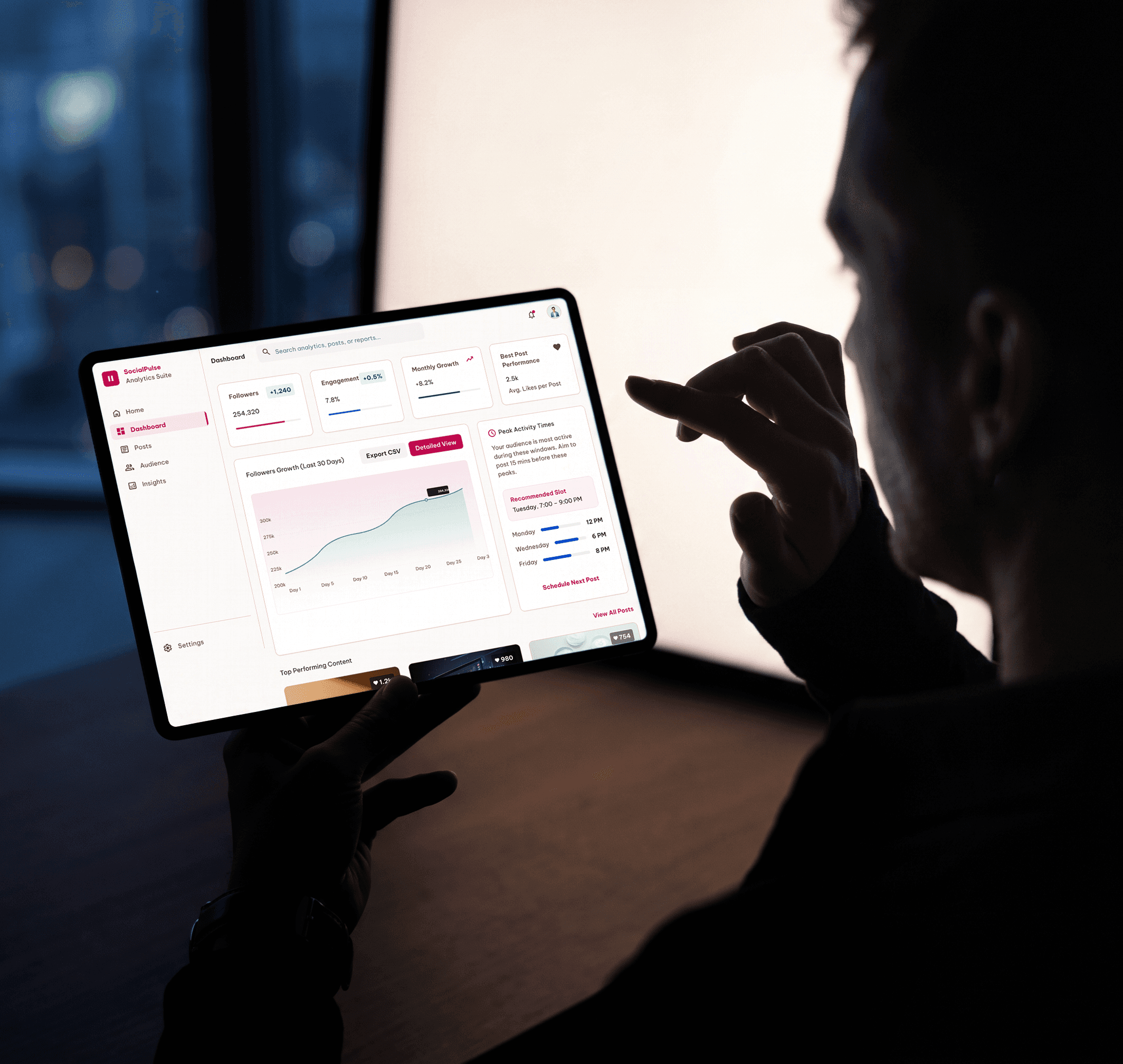
I designed a single decision-ready view built on visual hierarchy, not chart density. An age-demographics donut anchors the top-left as the entry point, a global reach map makes geography instantly scannable, and an hourly activity pattern chart highlights peak windows with a single accent bar. Trending interest tags use colour-weighted pills so emerging topics surface at a glance, and an AI insight card translates the data into a plain-language recommendation.